![]()
ShelterBox is a disaster relief charity based in Cornwall which decided to look for a new accounting system having come to the conclusion that it had outgrown its existing Sage product. Accountant Rob Evans gives his thoughts on the new system he helped to put in place.
Evans headed up a small team which selected an Access Dimensions and Dashboard solution, and coordinated its implementation. “Our senior management team are often out raising awareness about the work we do, and they are also out in the field a lot. So it’s useful for them to have key data readily available on their laptops via a virtual private network (VPN). Currently we have around 15 people using the dashboard - our trustees, our senior management team, myself and the head of corporate finance. There is no doubt it is extremely useful.”
He adds: “We can tailor each individual view to what the user needs or wants to see, we can cater to the various managers’ need for key facts and key data. One of the major advantages is that they can get the information in a really user-friendly format, such as a chart for example, and they can drill down from there if they want to examine the underlying details in more depth. So we no longer need massive reports, as you access all the details straight from the dashboard.”
Because the software is modular, it also gives the organisation a route to grow, and brings real-time reliable reporting to the organisation. The modules that ShelterBox decided to implement were: Bill of Materials, Purchase Order Processing, Works Orders, Purchase Ledger and Financials. The solution has full Microsoft Office integration, with the dashboard sitting on top of all the modules with full access to all the relevant data.
Reasons for using the dashboard
“We had some good ideas as to what we wanted to be able to see and when the consultants came in they wrote the scripts for us. Since then, I have done a bit more and tailored some of it. The GUI (graphical user interface) is good and intuitive and I like the fact that I can use my own colours. We predominantly use bar charts as they’re very easy to look at but we also have some line charts for trends and a couple of speedometers for the stock value and bank balance.
“Finance lends itself to bar charts and pie charts very well,” he continues. “Everyone in management uses it to track the overall performance of the organisation and our eight key performance indicators. We’re using Dashboard to track disasters, which are plotted straight into a map view. This allows us immediately to see what and where we have deployed, and this includes a number of disasters which are not in the eye of the public.”
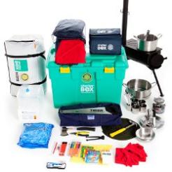
ShelterBox uses the dashboard in a variety of ways, explains Evans. “We use the dashboard to show the cost of each box which is deployed to a disaster area. The average cost varies depending on where the box is going, the contents vary to match requirements and the transport varies quite dramatically. As for the KPIs, on the top level we track quite a lot, we’re very focused on the number of boxes in stock and our income levels, as we’re always trying to finance as much stock as we possibly can. We also keep a close eye on the cash flow and the bank balance.
“One thing which is very useful is that we also make reports available via the dashboard. All my management accounts and the latest month’s figures are dropped in with a link to a PDF. Hence, when our senior management are out in the field they always have access to the latest management data.”