A national pregnancy and baby loss charity aims to double its income from £7.5m to £15m in the next five years after rebranding.
Sands’ financial goal is part of its rebranding effort to reach a wider audience, which includes launching a new logo.
The charity spent close to £40,000 on the brand refresh, which spanned over the last 18 months and was the first major change the charity made to its brand since 2012.
Daniel Brett-Schneider, director of income and engagement of the charity, said: “We believe that this investment in our brand will see a positive return in terms of supporting us to reach more people, build supporter engagement and recognition of our work to both save babies’ lives and support anyone who needs us.
“We anticipate that this investment in our brand is key to helping Sands double its income from £7.5m to £15m in the next five years, generating more funds to spend on our core objectives.”
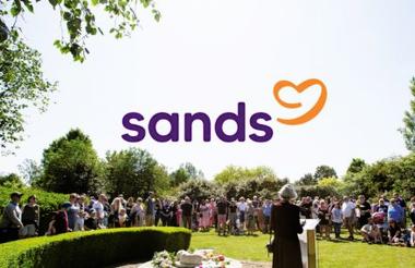
A new logo and symbol
Sands hopes the refreshed brand will help it to reach more people who need support after experiencing baby loss and help the charity to speak more clearly about the work it does to prevent babies from dying.
The charity, originally named the Stillbirth and Neonatal Death Society, had been receiving feedback from people who said that they were not clear about what it does.
The 18-month consultation included workshops, surveys, steering groups and consultations with bereaved parents and families.
The charity said its new logo is simpler and warmer and with a tone of voice that “feels more like a conversation than a campaign”.
It is also taking a sustainable approach to rolling out its refreshed brand, with digital platforms updated initially and other content updated or restocked whenever it's needed.
Brett-Schneider said: “Our logo and the symbol within it tell the story of both the saving and supporting sides of what makes us uniquely Sands.
“People told us that this symbol represents our voices speaking up about baby loss.
“The subtle reference to an infant shape is a connection to our brand heritage. And people shared they felt it represents a warm, inclusive embrace at a moment when most needed, a heart to express our compassion or a bright beacon of hope at a time when all may feel lost.
“A story of duality between saving and supporting that is, and always has been, embedded into the very name of Sands itself.”
“We want anyone touched by pregnancy or baby loss to know that Sands is here for them. Always.”
Related articles