Pancreatic Cancer Action has launched a new identity based on the shape of the pancreas, to help it stand out and appeal to new audiences.
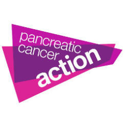
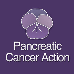
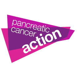
The bright purple and pink trapezium design replaces the charity's purple pansy logo and is intended to be more relevant to the cause by being an abstract of the shape of the pancreas.
Ali Stunt, chief executive of Pancreatic Cancer Action, said: “We wanted to make sure that our brand reflected the energy and passion of our charity as well as our supporters, fundraisers and donors who make our work possible.
“Sadly all of us at the charity are aware of the devastating impact that late diagnosis of pancreatic cancer has on people’s lives with many patients surviving a very short time from diagnosis. We hope our new look will help us ultimately save lives by getting more people diagnosed early.”
Design agency Sparrowhill Studio carried out the work pro bono. James Robinson, owner of the consultancy, whose father died of Pancreatic Cancer, said he got in touch with the charity after its high-profile ‘I wish I had breast cancer’ campaign last year.
Robinson said: “Before my father got it, I wasn’t even aware of the pancreas as an organ – I had no idea what it did. It’s literally buried deep behind other organs, and the public has a layman’s understanding of it. I wanted to increase their knowledge of the condition.”
Old logo | New logo |
|
|