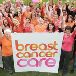
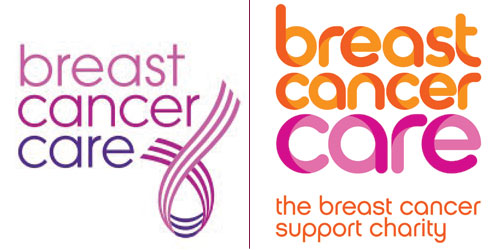
Breast Cancer Care has unveiled a new-look brand, ditching the iconic ribbon and replacing much of the pink with orange, in a move designed to help it stand out in the pink breast cancer market.
The new logo and strapline ‘the breast cancer support charity’ were released today as the charity aims to increase public awareness of its services and boost support.
Director of services Diana Jupp told civilsociety.co.uk that at present only around one in 100 people know about Breast Cancer Care, and that it wants more people diagnosed with the disease to know that they can turn to the charity for support.
“We need to ensure that we’re instantly recognisable and understood as the charity that’s about support and information rather than research, so we wanted to refresh and revive our image and one of the ways we’ve done that is to move away from pink so that we get stand-out,” she said.
“Using orange as our principal colour, supporting it in pink in the background, gives us a slightly different message. It makes us look different from the other breast cancer charities. It’s bold.”
However, Breast Cancer Care is not dispensing with pink altogether due to the fact that pink is so critical to breast cancer fundraising.
“It’s the colour that people associate with breast cancer. It’s been around as the colour of breast cancer for many years and so we continue to have it in our colour palette. Our fundraising asks will have more pinkness in them because our supporters and fundraisers like the pink. For some people, however, it’s come to represent something different. We want to make sure people living with breast cancer see us as serious, confident and the place to call on, rather than were you go to raise the money for breast cancer,” said Jupp.
Fundraising income was up slightly at Breast Cancer Care last year, however the charity had missed a number of fundraising targets. Income from individuals had been particularly strong, growing by 10 per cent within the year.
Jupp said that in testing, the orange had proven a more inclusive visual identity which worked well with men, family and friends as well as diverse communities.
“We want to reach more supporters and for them to realise who they’re raising the money for and where the money goes,” she said.
The refresh of the brand was a year in development at a cost of £95,000. Jupp said that the charity will not be changing all its material with the new brand immediately, in order to save money, but will rather use all its old branded stock and refresh it with the new-look brand within a natural cycle.