
Last month, Smashing magazine published an article highlighting 11 different charity websites and how they had focussed on the usability of their website. I’d highly recommend anyone interested in charities and the web read it, as it showcases some very distinctive yet usable charity sites, as well as giving some great advice for improvements.
But what I wanted to focus on was the element of creating delight with your users. Yes, you want them to be able to navigate your site so they can find what they want, have a smooth donation process and understand what it is that you do, but can you make them smile too? Branding is something you might not necessarily associate with delight, certainly it’s something that’s often obsessively guarded, yet your branding can be, well, delightful.
The best opportunities for making a visitor to your website smile sometimes lie in the smallest things. And by making someone smile, generating an emotional response, you create a much stronger connection with a brand than just them knowing what your official colour is. One of the charities listed by Smashing magazine as an example of good usability was Dogs Trust, but there were a couple of things the article didn’t pick up on but that I think are were brilliant.
Take for example the humble search bar. You need it, so you can find things right? Just enter a word, and hit ‘search’. Well, not on their website – you enter your term and click “fetch” (see images below). Clever huh.
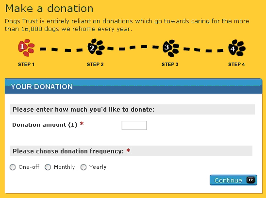
If you want to donate on their website, they include breadcrumbs to let you know how far along the process is (this is a technique that generally improves conversions).
Normally you’d have buttons showing the step you’re on. On their website, they use paw prints instead of buttons:
So here are two examples of what could be mundane, every-day processes or words that have been turned into elements of branding. They communicate the charity’s brand and mission in a way no colour or logo width could ever do, whilst making the site usable to boot – a double win, if you like.
And they are quite subtle too, especially the second example, so you might not even notice them. But that’s what makes them even better. As once you do notice them, you’d be that much more impressed.
This is what’s known as Easter Eggs in the design trade (according to Wikipedia at least) – like adding hidden surprises or nuances into everyday-seeming software. As an example, have you ever noticed the extra image in the FedEx logo?
I first read about Easter Eggs on the (sadly no longer updated) “creating passionate users” blog by Kathy Sierra. Here’s a great post she wrote about the case for having Easter eggs of the non-chocolaty kind back in 2005.
If you’re interested in this, watch a presentation she gave on how to grow and nurture your community a couple of years ago. The advice is still highly relevant today, especially for charities wanting to look after their community online.
Need more examples of why this is a good thing? See this post on “delight and surprise” from James at the word of mouth agency 1000heads yesterday.
It really is the small things that make the difference, so what do you think you could do to create some unexpected delight with your audience?
Smashing magazine article: Usability Review of Charity Websites Taking the Lead


