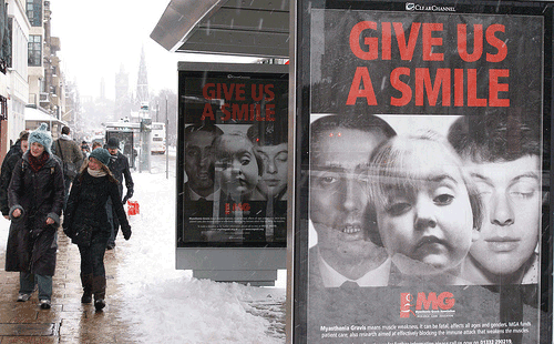
The cryptic 'Give Us A Smile' poster campaign by the MG Association offers a lesson to all charities: make clear what you're advertising or deal with a confused public, says David Burrows.
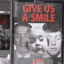
I keep seeing a poster that has three faces that look sad, because they are unsmiling and in black and white. It is an odd, unsettling image, vaguely reminiscent of the mug shots of the infamous Moors murderers.
It is coupled with the cryptic headline ‘GIVE US A SMILE’. There is a logo that simply says ‘MG’, in red.
The problem is that this poster is usually displayed on bus shelters and I generally only see it from my car, so the image, headline and logo are all I ever see. Unfortunately the image, headline and logo leave me none the wiser.
Having investigated further I now know that this is a poster for a small - and no doubt very worthy – charity called the Myasthenia Gravis Association. I now understand that Myasthenia Gravis is a condition that causes muscle weakness and can be fatal, and that the Association are funding vital research into this condition.
I know this because I am the kind of weirdo who is sufficiently intrigued and perplexed by bad advertising to investigate further. Maybe millions of other people have been sufficiently intrigued and perplexed to do the same – but maybe not.
I think there are lessons for us all here. Anyone planning a poster campaign needs to be really clear about the objectives and the target audience. Are we primarily trying to engage families already affected by the condition, trying to raise awareness of symptoms to prompt earlier diagnosis, or trying to raise awareness of the condition among the entire general public?
Then we need to remember to keep it simple, stupid. If we are creating a poster that will be displayed on roadsides around the UK it seems a shame to have such a cryptic combination of image, headline and logo that leave passing drivers scratching their heads. Bus shelter posters aren’t just for bus queues.
I’m sorry to be mean about the advertising of a tiny charity who probably don’t have the resources to employ professional advertising people. If they want a better poster I’ll happily do them one. But it isn’t just small charities who get this wrong. Good posters need to be simple and single-minded. For a better example check out the latest National Trust posters, which are an object lesson in simplicity and clarity.