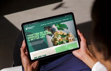
The Vegetarian Society has announced a rebrand including a new logo, redesigned website, and renamed magazine.
Founded in 1847, the charity’s rebrand follows its new communication strategy, which aims to produce punchier, more direct messaging and impactful calls to action.
The charity, which recorded an income of £1.08m in the year to March 2023, said it paid Manchester-based Instruct Studio “just under £50,000” for the combined brand and website.
Its membership magazine, previously called the Vegetarian, will now be called the Pod and aimed at embracing a broader demographic interested in changing their diet and lifestyle to reduce their impact on animals, health and the environment.
Richard McIlwain, chief executive of the Vegetarian Society, said: “It’s with the future in mind that we’ve decided to evolve our brand, in line with a Society that wants to be far more outwardly focused on creating real change – for the rights of animals, for the sake of our own health, and of course for the future of the environment on which we all depend.
“While our traditional ‘V’ symbol has evolved to reflect a more confident and assertive organisation, we’ve been mindful not to lose sight of our heritage. After all, no one else can claim more than 175 years of campaigning on vegetarian issues.”
John Owens, creative director of Instruct Studio, said: “We harnessed the passion for change within the society in our initial workshops and worked closely to develop messaging and tools to fight the good fight, our first challenge was a new distinctive ‘V’ symbol which acts as a flexible container device.
“The typography was sourced from original recipe books found in their extensive library giving a nod to the history, alongside new bolder type to make impactful messaging.
“In an ever-increasing digital world the brand is built to cut above the noise and get straight to the facts, we couldn’t be more excited to see how it will grow over the coming years.”
Related articles


