Medical Emergency Relief International (Merlin) has unveiled a new logo and website as a springboard for a four-year strategy to double its income.
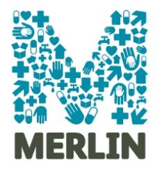
The logo, Merlin’s fifth in 17 years, was designed by the branding consultancy Spencer du Bois and aims to reflect to the full extent of its emergency relief work and its longer-term health infrastructure projects.
And the new website, designed by Burnett Works, incorporates donation facilities on almost every page.
The site, which incorporates photojournalism of projects and a Flash map of international work being carried out by Merlin, has been revamped in a bid to double the charity’s income in four years and bring donors closer to frontline workers.
Research showed that the Merlin brand, although well known, did not reflect the full scope of the charity’s work and its status as a globally respected health charity.
At its inception in 1993 the charity provided international medical support to people in Bosnia and Rwanda, however 17 years later the charity encompasses both short-term relief and long-term work in both grassroots and top-down capacities.
The logo is made up of health-related symbols, hands, hearts, medical aid, clean water and shelter which together make the letter M. Underneath the symbol, Merlin is spelt out in capital letters, a move away from the traditional taglines that the charity has traditionally used.
Merlin hopes the logo will help to increase its fundraising income and reach out to a broader range of audiences including both the UK public and government health departments internationally where Merlin work.
Max du Bois, executive director of the consultancy, said that branding is key to developing bigger funding streams for the charity. “The crucial part of the project was to create a brand that combines emergency relief efforts and the underestimated work to rebuild health systems.”
The Times newspaper will feature the rebranded Merlin in its Christmas Appeal 2010.